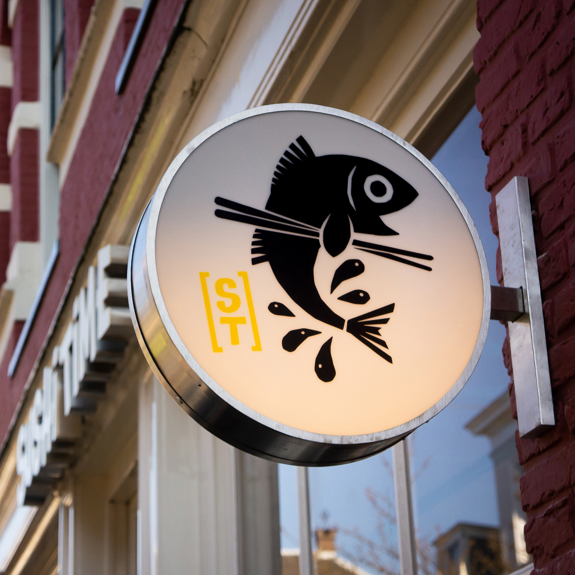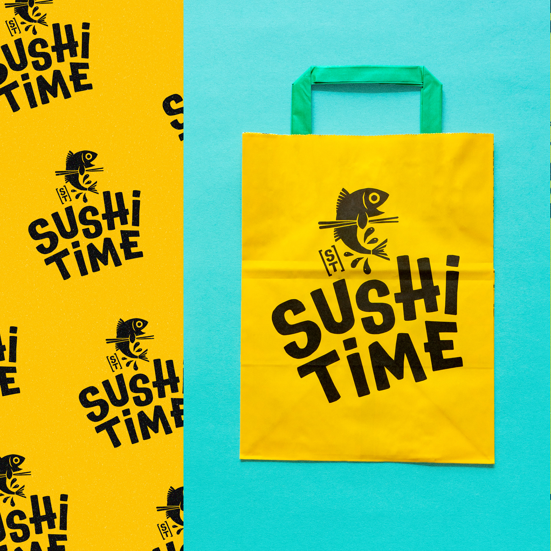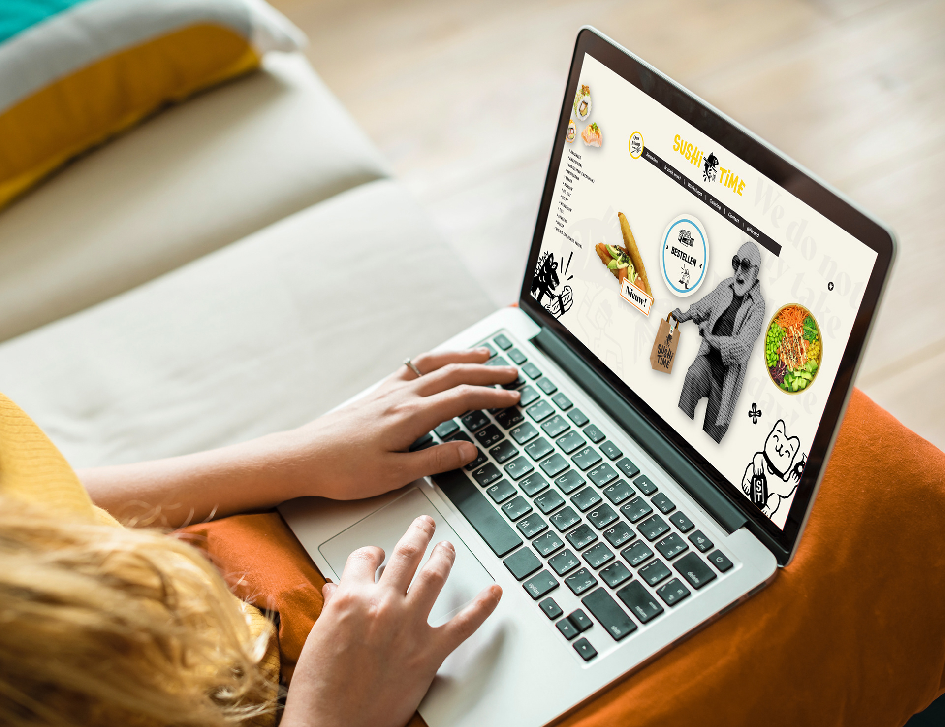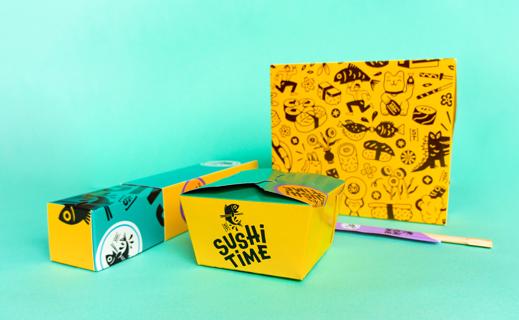
Sushi time! I Had the honour of working on an illustrated pattern and the logo mark for the rebranding of Sushi Time Nederland
We decided to go for a direction influenced by my lino print work: chunky lines, hard contrasts, and solid colour. This turned into a set of playful illustrations with many references to Japan.
We decided to go for a direction influenced by my lino print work: chunky lines, hard contrasts, and solid colour. This turned into a set of playful illustrations with many references to Japan.
Lettering, AD and overall brand identity by Jobert van de Bovenkamp - Behave Studio.
....